Skip to content

feat(checkbox,radio): add bordered group appearance - #664

Open
mattrothenberg wants to merge 5 commits into
mainfrom
feat/bordered-choice-groups
Open

feat(checkbox,radio): add bordered group appearance#664
mattrothenberg wants to merge 5 commits into
mainfrom
feat/bordered-choice-groups

Conversation

@mattrothenberg

@mattrothenberg mattrothenberg commented Jul 24, 2026

Copy link
Copy Markdown
Collaborator

Adds a new "bordered" appearance for Checkbox.Group and Radio.Group, plus horizontal orientation support for Checkbox.Group.

Screenshot 2026-07-24 at 5 26 57 PM Screenshot 2026-07-24 at 5 23 25 PM

Changes

  • Checkbox.Group: new appearance="bordered" and orientation props
  • Radio.Group: new appearance="bordered" option
  • Bordered items use shared outer border + dividers between options
  • Selection is indicated by the control only (no selected background fill)
  • Added demos, docs examples, and tests

Checklist

  • Reviews
  • bonk has reviewed the change
  • automated review not possible because: significant visual/design changes require human review
  • Tests
  • Tests included/updated
  • Automated tests not possible - manual testing has been completed as follows:
  • Additional testing not necessary because:

@pkg-pr-new

pkg-pr-new Bot commented Jul 24, 2026

Copy link
Copy Markdown
npm i https://pkg.pr.new/@cloudflare/kumo@664

commit: e8abcd7

@github-actions

Copy link
Copy Markdown
Contributor

Docs Preview

View docs preview

Commit: a5f7d4d

@github-actions

Copy link
Copy Markdown
Contributor
Visual Regression Report — 26 changed, 17 unchanged

26 screenshot(s) with visual changes:

Button / Basic

342 px (0.39%) changed

Before After Diff
Before After Diff

Button / Variant: Ghost

101 px (0.11%) changed

Before After Diff
Before After Diff

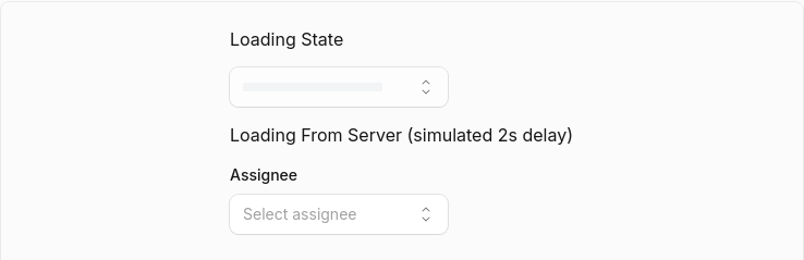
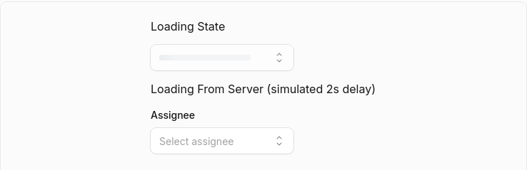
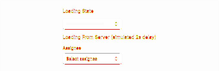
Button / Loading State

523 px (0.59%) changed

Before After Diff
Before After Diff

Button / Disabled Link

629 px (0.71%) changed

Before After Diff
Before After Diff

Dialog / Dialog Basic

396 px (0.45%) changed

Before After Diff
Before After Diff

Dialog / Dialog Sizes

2,298 px (2.59%) changed

Before After Diff
Before After Diff

Dialog / Dialog Alert

1,066 px (1.2%) changed

Before After Diff
Before After Diff

Dialog / Dialog Confirmation

855 px (0.97%) changed

Before After Diff
Before After Diff

Dialog / Dialog With Select

383 px (0.43%) changed

Before After Diff
Before After Diff

Dialog / Dialog With Dropdown

383 px (0.43%) changed

Before After Diff
Before After Diff

Dialog (Open)

0 px (0%) changed

Before After Diff
Before After Diff

Select / Select Basic

993 px (1.12%) changed

Before After Diff
Before After Diff

Select / Select Without Label

728 px (0.82%) changed

Before After Diff
Before After Diff

Select / Select With Description

1,688 px (1.62%) changed

Before After Diff
Before After Diff

Select / Select With Error

1,730 px (1.66%) changed

Before After Diff
Before After Diff

Select / Select Placeholder

1,234 px (1.39%) changed

Before After Diff
Before After Diff

Select / Select With Tooltip

657 px (0.74%) changed

Before After Diff
Before After Diff

Select / Select Custom Rendering

973 px (1.1%) changed

Before After Diff
Before After Diff

Select / Select Loading

2,475 px (1.4%) changed

Before After Diff
Before After Diff

Select / Select Multiple

1,265 px (1.43%) changed

Before After Diff
Before After Diff

Select / Select Complex

1,279 px (1.23%) changed

Before After Diff
Before After Diff

Select / Select Disabled Options

1,555 px (1.76%) changed

Before After Diff
Before After Diff

Select / Select Disabled Items

817 px (0.92%) changed

Before After Diff
Before After Diff

Select / Select Grouped

895 px (1.01%) changed

Before After Diff
Before After Diff

Select / Select Long List

2,196 px (2.11%) changed

Before After Diff
Before After Diff

Select (Open)

2,237 px (0.01%) changed

Before After Diff
Before After Diff
17 screenshot(s) unchanged
  • Button / Variant: Primary
  • Button / Variant: Secondary
  • Button / Variant: Destructive
  • Button / Variant: Outline
  • Button / Variant: Secondary Destructive
  • Button / Sizes
  • Button / With Icon
  • Button / Icon Only
  • Button / Disabled State
  • Button / Title
  • Button / Link as Button
  • Button / Link with Tooltip
  • Dialog / Dialog With Actions
  • Dialog / Custom Max Width
  • Dialog / Dialog With Combobox
  • Select / Select Sizes
  • Select / Select Grouped With Disabled

Generated by Kumo Visual Regression

@mattrothenberg

Copy link
Copy Markdown
Collaborator Author

/bonk review

@ask-bonk

ask-bonk Bot commented Jul 24, 2026

Copy link
Copy Markdown
Contributor

@mattrothenberg Bonk workflow was cancelled.

View workflow run · To retry, trigger Bonk again.

Sign up for free to join this conversation on GitHub. Already have an account? Sign in to comment

Labels

None yet

Projects

None yet

Development

Successfully merging this pull request may close these issues.

2 participants