Conversation
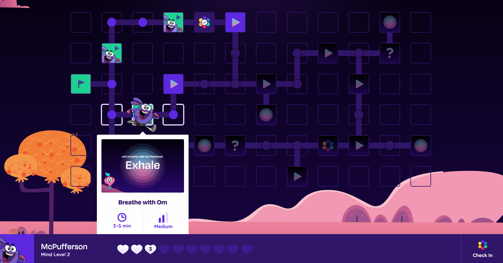
GN-55 Preview popovers for level tiles
Tile States - GoNoodle Define (Figma) Level tiles should provide previews of the level, estimated duration, and energy level. Consider the experience for tablet users as well. |
|
The latest updates on your projects. Learn more about Vercel for Git ↗︎
|
# Conflicts:
#	src/components/WorldBoard.tsx
| <Image | ||
| className="w-full rounded" | ||
| src={breatheLevelPreviewThumbnail} | ||
| alt="Stack of vibrant discs that expand and contract on inhale and exhale" |
There was a problem hiding this comment.
I'm a copywriter can't you tell? 😏
| <Tooltip.Provider> | ||
| <Tooltip.Root open={isHovering || isCurrentPlayerPosition}> |
There was a problem hiding this comment.
Considered using a Popover from Radix because it seems to be the correct choice based on what we want to achieve here but decided to go with Tooltip for a couple reasons:
- We don't want to trigger the preview with a button, which seems to be the intended purpose for Popover
- We don't want to trap focus into the preview, which Popover will do.
Although these caveats can be overridden, I think it adds complexity and probably defeats the purpose anyways.
|
|
||
| <ChampPlayer classroomChamp={mcpuffersonClassroomChamp} /> | ||
|
|
||
| <div id="board-tooltips" /> |
There was a problem hiding this comment.
Decided to portal every tooltip to this container so that it sits above the board and we can avoid funky z-index issues.
| /** | ||
| * Returns a stateful value, and a function to update it with a timeout. | ||
| * | ||
| * @param initial - initial state value | ||
| * @param delay - timeout duration for setting state value | ||
| */ | ||
| export function useTimeoutState<T>( |
There was a problem hiding this comment.
Does exactly what it says on the docs, but happy to huddle and explain how this is used in LevelTile!
There was a problem hiding this comment.
Should edge cases like this be considered or is it intuitive enough to scroll since the button is hiding behind the bottom UI bar? For example should the tooltip logic account for the UI bar and the tooltip jumps to the top sooner so that the button isn't hidden? I feel like it's intuitive enough to scroll but figured i'd flag this.
|
|
||
| <ChampPlayer classroomChamp={mcpuffersonClassroomChamp} /> | ||
|
|
||
| <div id="board-tooltips" /> |
There was a problem hiding this comment.
@RegisBiron opening up a thread about your note. It's a good question! I had thought that it's intuitive to scroll down, but do you think it could work better if we give these tooltips a higher z-index than the progress bar or is that weird?
There was a problem hiding this comment.
Also, most users would be using this on a 1920x1080 TV, which I think means this edge case is unlikely
 joshpensky
left a comment
joshpensky
left a comment
joshpensky
left a comment
There was a problem hiding this comment.
Lookin good! 🤩 Just a few comments/q's
|
|
||
| export default function EnergyBars({ className, energy }: EnergyBarsProps) { | ||
| function getBarFillClass(i: number) { | ||
| const energies = ["low", "medium", "high"] as Energy[]; |
There was a problem hiding this comment.
Preference for explicit type declarations over as narrowing!
| const energies = ["low", "medium", "high"] as Energy[]; | |
| const energies: Energy[] = ["low", "medium", "high"]; |
| ); | ||
| } | ||
|
|
||
| export interface PreviewProps { |
There was a problem hiding this comment.
quick fix!
| export interface PreviewProps { | |
| export interface LevelPreviewProps { |
| duration: 0.1, | ||
| }, | ||
| translateY: { | ||
| type: "spring", |
There was a problem hiding this comment.
non-blocking: the spring felt a bit too bouncy for a tooltip to me, so I played around with a different animation style in #27!
| }, [state.context.coordinates, coordinates, setIsCurrentPlayerPosition]); | ||
|
|
||
| function onHoverStart() { | ||
| setIsHovering(true); |
There was a problem hiding this comment.
Let's remove these in favor of the tooltip's onOpenChange event:
<Tooltip.Root open={isHovering || isCurrentPlayerPosition} onOpenChange={setIsHovering} delayDuration={0}>There was a problem hiding this comment.
@joshpensky we want to keep those because we're detecting the hovers from the motion.div's onHoverStart and onHoverEnd. If we move it to onOpenChange, setIsHovering won't be called!
There was a problem hiding this comment.
Ahh I see, thanks for calling out! Let's keep it as is for now then
| width="3" | ||
| height="11" | ||
| rx="1.5" | ||
| fill="#5D15E3" |
There was a problem hiding this comment.
tagging the fill attr here !
# Conflicts:
#	src/components/Tile/FinishTile.tsx
#	src/components/Tile/StartTile.tsx
#	src/components/WorldBoard.tsx
4 participants
What This Does
divcontainer to avoid z-index issues with the board.CleanShot.2023-01-31.at.15.32.26.mp4
How to Test
Accessibility Checklist
<img>tags have appropriatealttextSee the
Playbook accessibility page
for more details.